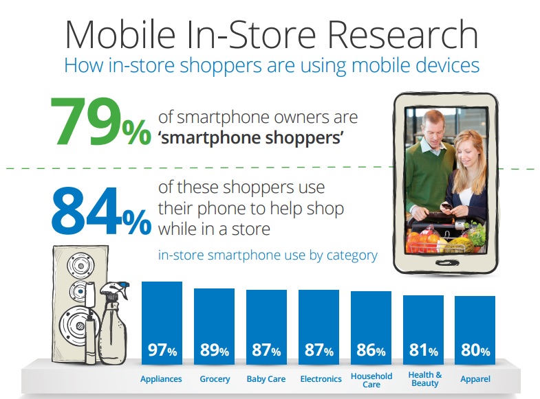
The Smartphone has become so integrated with our life that it has seeped into every activity that we do, including shopping. No longer do you need to wear out the soles of your shoes to get your desired items home, all it takes a few taps and touches to get the job done. Most shopping sites and even some famous retailers have introduced mobile commerce app so that you can enjoy shopping on the go.
However, how you design your app can make or break sales. In a recent survey, a substantial 79%of respondents have confirmed that they would swiftly turn to the competitors’ app if their mobile shopping experience were not satisfactory.
Here are some things you need to keep in mind while designing a successful mobile commerce app.
VISUAL CLARITY
Clear, High-Resolution Images
When buying something without seeing it in real life, high quality images make the process easier. A good app should support high quality images as well as allow the buyer to see multiple angles and zoom in to get a closer look at the product. Visual appeal is a key factor in shopping sites as most people shop for what ‘catches the eye’!
No Clutter
Even though images are important, make sure the screen is not too busy. Keep words to a minimum and keep the additional details hidden. Keep important details like the price and availability on the foreground while other information can be tucked away in a pull down menu. You can also use colour to highlight the next step of the process. This allows the user to move swiftly across the app and securing a purchase quickly.
Use of Icons
Icons play prominent roles in mobile app industry. You can use creative and interesting icons to grab the attention of the targeted audience but you need to make sure that you are not using unfamiliar icons. Stick to familiar icons while designing and developing a mobile app because people might fail to relate the icons with their respective functions and this will have a negative impact on the UX.
BROWSE EASY
Organised Browsing
The main obstacle in a shopping app is sorting the enormous amount of data in a streamlined manner. While on a computer, you can leap from category to sub-category to sub-sub-category easily, on a phone it is annoying. One good idea is to implement reductive navigation. This means that when you have entered a particular subcategory, the other sibling categories are hidden. You only see the options that fall under the chosen sub-category. This makes it easier to trace your steps back up the ranks.
Item Search
First thing you need to do is incorporate a search option in your app. Users do not like to dig deep into your navigation to find what they want. The next step is to have the auto-complete. You can never fully optimize ‘search’ unless you fit it with the auto complete option. This saves the user from the frustration of typing out the entire words and help find their item quicker.
Product Carousel
Shoppers are an insatiable breed. Even when they are looking at something they want, they want to see more things that they might want! To tap into this inherent trait of the shopper, a product carousel allows them to view similar products so that they have all their options laid out before them.
QUICK CHECKOUT
Spot the Cart
Shoppers are often carried away with browsing through the various options. They might often find themselves so deep within the layers of categories that they forget where they initially were. That is why it is a good idea to keep the cart available from every page so that they can check out as soon as they are ready.
Remember Details
Another good way to the customer coming back is to remember important details like name, shipping address, etc. so that the user does not need to enter it every time and future purchases are quicker.


